Randall design maximizes use of footprint to help families get the size they need at achievable prices
As Featured in the Winnipeg Free Press
ABOUT 10 years ago — when interest rates were low and lot prices weren’t outrageously high — two-storey homes routinely checked in at 2,200 square feet or more in size.
These days, with interest rates steadily increasing and lots selling for a small fortune, builders have been forced to build smaller homes on more compact lots to keep prices down.
Yet, families are still expecting smaller homes to possess the function and flexibility required to live their lives in free, unfettered fashion.

Consequently, when they see a home that’s listed at just over 1,800 sq. ft., they can’t help but wonder how livable a mid-sized home can be.
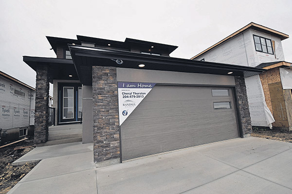
Randall Homes’ brand-new show home at 326 Zimmerman Dr. in Charleswood’s RidgeWood West is a shining example of just how livable a mid-sized home can be, says Jon Wiebe, the sales representative for the 1,812 sq. ft., two-storey design.
“The Douglas 36-A is a really thoughtfully designed home,” he says. “It’s full of thoughtful little design features that come together to make a home that offers a wonderful balance of function and style.”
That exceptionally high level of function starts in the foyer, notes Wiebe.
“It’s somewhat unique in that there’s some separation between it and the main living area. At the same time, it’s very majestic and welcoming, with an eight-foot-high front door, eight-foot closet and soaring 17-foot ceiling. A cutout on the wall facing the front door with tempered glass border opens the home’s upper level up to the foyer, cre- ating an even greater sense of space.”

There’s more function waiting in a compact wing to the right of the angled hallway that leads into the main living area, he adds.
“Somehow, Randall’s design team found room for a two-piece bathroom and lifestyle room. The lifestyle room could be used as a home office, or as a bedroom. If it’s used as an in-law suite, the bathroom could be expanded to put in a shower.”
Take a few steps forward, and you step into a main living area that ex- ceeds expectations in every way.
Bright, spacious, and beautifully laid out, its livability quotient is off the charts.
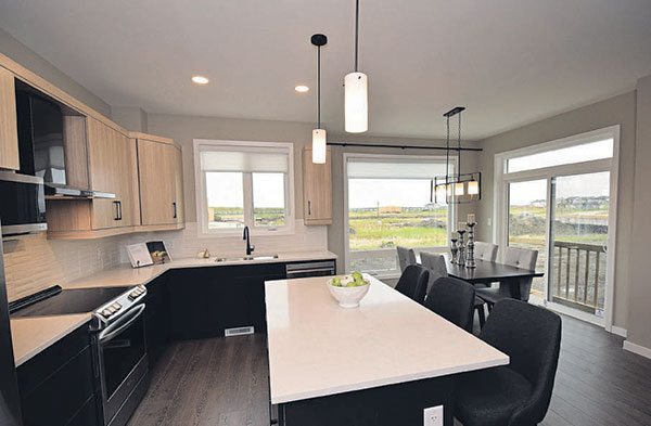
“What I really like about its design is that you clearly have defined spaces, yet each space — kitchen, eating area and great room — is still open and spacious,”
Most importantly, the area is filled with natural light.
“Essentially, there’s more glass than there is wall at the rear of the home — the back wall is basically all windows,” he says. “There’s just so much natural light. When you combine that with a nine-foot ceiling, you get a beautifully bright, spacious feel.”
Indeed, each space is plenty big.
A mid-sized, six-foot island ensures there’s plenty of room to move around and create in the kitchen, while both the eating area and great room are deceptively large.
“The eating area is very expandable and can be set up to accommodate 12 guests or more. And the kitchen is very functional with a walk-in pantry with eight-foot door and island with uninterrupted prep space, a small but important feature that improves function.”
Then, there’s the great room, which is centered around an exceptionally elegant entertainment unit.
“Its focal point is a gorgeous brown porcelain tile feature wall with electric ribbon fireplace set down low and a TV niche in its center, and open shelving on either side. It finishes off the space perfectly.”
A wide, angled staircase set to the right of the kitchen then leads up to an efficiently designed second floor.
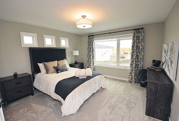
“Again, the layout is well-thoughtout. The two secondary bedrooms, main bathroom and laundry room were placed down a hallway to the right of the stairs, while the own- er’s suite was placed to the left of the stairs in a nice, private spot.”

Big and bright yet sufficiently cosy, it’s a place of respite for weary parents.
“The ensuite comes with a walk-in shower with gorgeous white/grey porcelain tile surround, rich-looking luxury vinyl tile-style floor and oversized vanity with quartz countertop and a huge amount of storage space.”
“There’s also two separate walk-in closets — a great feature.”
Wiebe says the Douglas 36-A proves that big-time livability can come in a mid-sized package.
“It’s all about the thought that goes into the home’s layout. Randall’s design team put in the time and effort to come up with a stylish, family-friendly de- sign, and it shows.”
View the Home Details here
Todd Lewys
